Sales App
A Sales application designed and built specifically for the Beanfield Sales team
🙋🏻♀️ My Role
I have been the sole product designer working on this product, performing UX research, usability tests, UI, and interaction design. I was also acting product owner of this application for some time.
I started the discovery phase of this project in Jan 2021, this product has been maturing with new feature launches every sprint ever since.
📋 The Problem
Context
At Beanfield, we build most of the tools our employees in various departments use in house. Before the Sales App, the team had developed a sales tool that was used internally for over a decade. However, with the processes changing and the company growing, there was a need to upgrade the system.
User Needs
Sales people were confused about the state of their opportunities. Search feature was not usable, crucial information was missing or hard to find, duplicate leads were created daily, there was no way for the sales leader to track and forecast sales, the overall information architecture and UI design was difficult to navigate.
Business Goals
I worked closely the VP of sales, CEO and COO along with sales leaders to understand the process they wanted the sales team to follow, and how the workflows and features of this product could help the sales team eliminate manual work so they have more time to bring more leads and make more sales.
📋 The Solution
Design Process
- The first step of my user research was to sit down with a few sales rep with different experience levels and ask them questions about their daily work, interactions with the tools they use, their pain points and goals. I’d like to create personas for the users of my products to ensure everyone on the team is on the same page about who the users of our products are.
persona image
- Next I’d like to watch the users performs some of the tasks that have come up, with the current state of the art they have access to. This helps me really understand where really the opportunities of imrpovement are
- Wire framing is a great tool to get some ideas down so I can share with them team what I think should be our immediate steps. I’d like to run some iterative sessions with my key stakeholders and a technical lead from my team, and go over some basic ideas, to ensure the focus sounds helpful to stakeholders, and the expectations in terms of technical achievements are appropriate.
- Once I have a good understanding of what to focus on for the the MVP, I define the scope of the project, and discuss it with stakeholders and my team.
- As soon as the scope of the MVP is defined, it’s time to start working on the nitty gritty interactions and high fid mockups. Of course the stakeholders are kept informed and consulted during this process.
- Mockups are ready, so it’s time to make a real-life scenario prototype and test it with some users. I try to recruit users that have not been already consulted to make sure I get realistic results. During user testing, I look for qualitative data such as how the user reacts and whether they can intuitively understand the flow, and quantitative data like SUS scores, task completion time, and number of errors.
Key Features
- New Design System
I designed a new design system for internal products we built at Beanfield, called Hopscotch. The Hopscotch design system is inspired by and built on top of Vuetify’s implementation of Material Design.
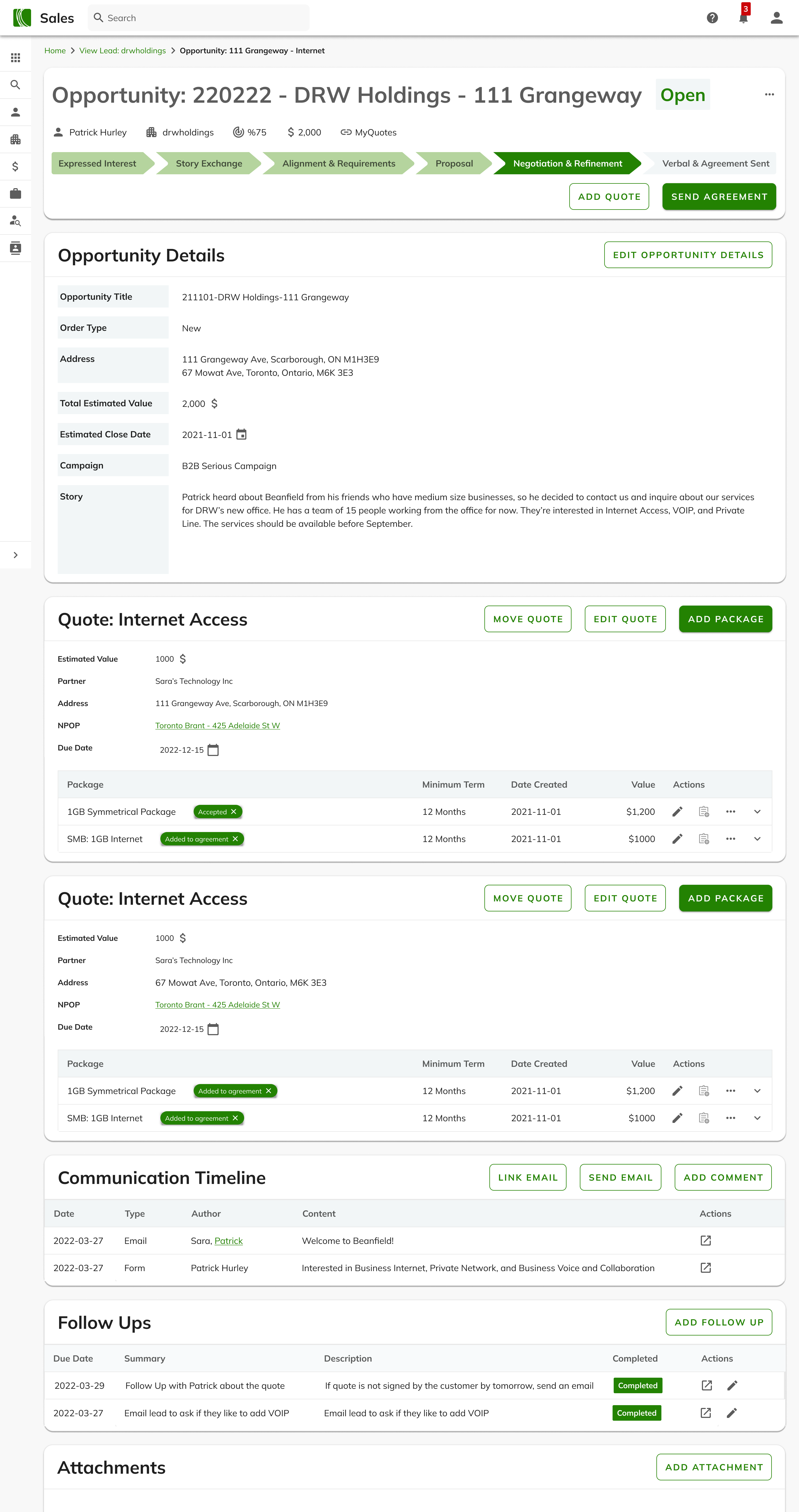
- Opportunity Page
The new and improved opportunity page helps the sales rep and their leader know what exactly is going on with each opportunity.
The concise but clear opportunity card shows the sales rep, client’s name, the estimated value of the opportunity, the categories of the services on the opportunity, and the state of the opportunity. The previous tool didn’t have a good way showing this information clearly.
Sales rep can add one or more quotes to the opportunity, each with a unique category and address combo. Quotes could have multiple package and term offerings for the customer to choose from. These delicate workflows were designed very carefully based on the feedback and experiences of sales reps and were thoroughly tested before the MVP version was approved.
The communication card shows all the entire timeline of emails, comments, and potential forms for the customer. The sales app is integrated with our email system, allowing the reps to link email communication to the opportunities and activities of each client.
Follow ups allow the sales reps and their managers to easily create to-do items and add due dates to ensure the follow up gets completed. There are notifications designed to ensure the sales reps won’t miss follow ups that are due soon or overdue
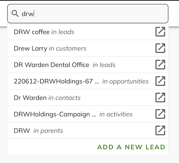
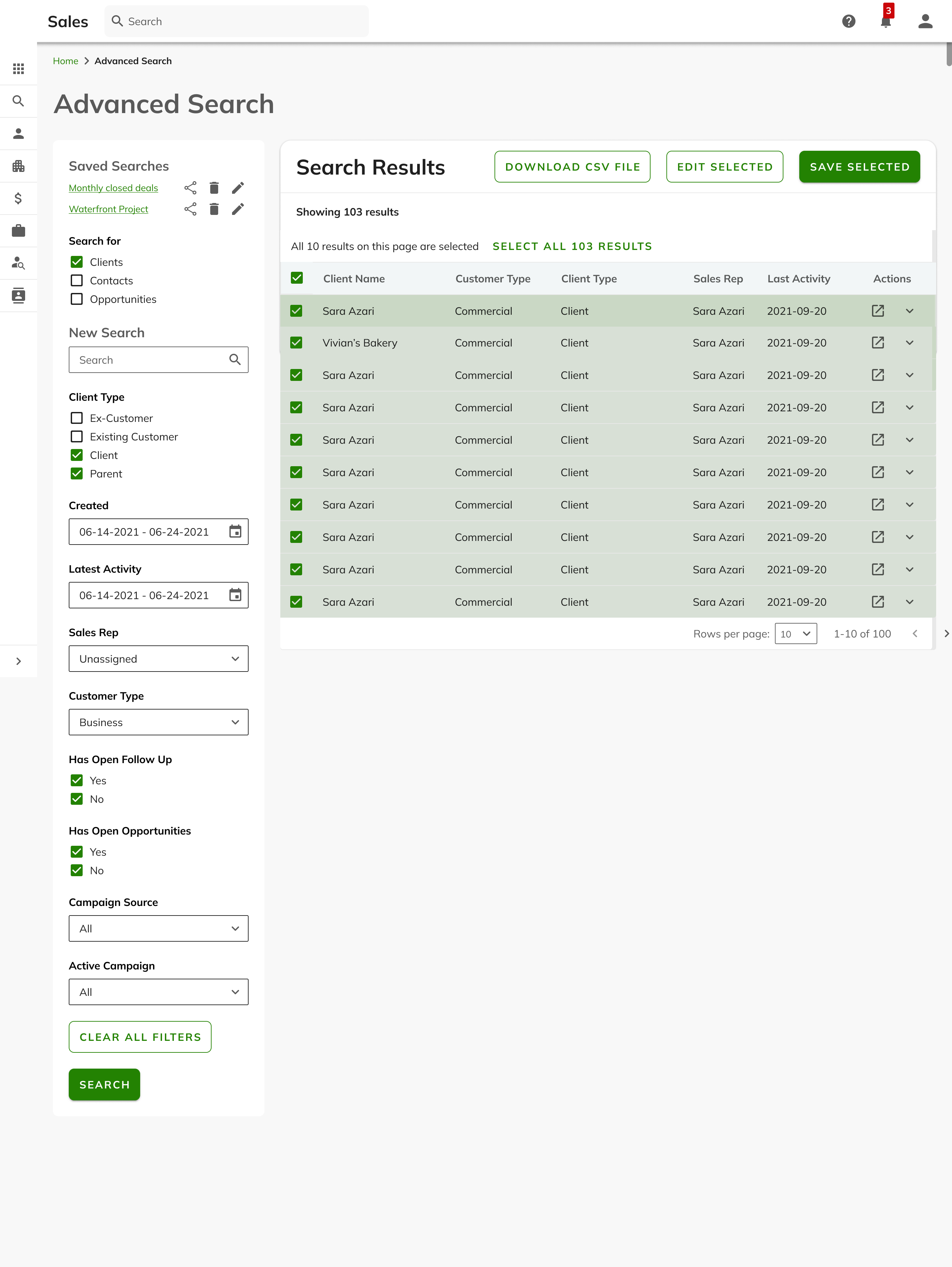
- Search and Advanced Search
Live search allows the users to search for clients, opportunities, activities, and parent companies. For a more thorough search, users may hit enter to land on a search results page, showing all the search results matching the search term.
The advanced search allows users to do more detailed searches and save them as a report. Advanced searches can also be shared with others and added to the sales dashboard for easier access.
- Linked Accounts
Sometimes we have more than one client account under the same holding umbrella, and the sales app allows to add this parent-child relationship, so we can get more accurate reporting in revenue
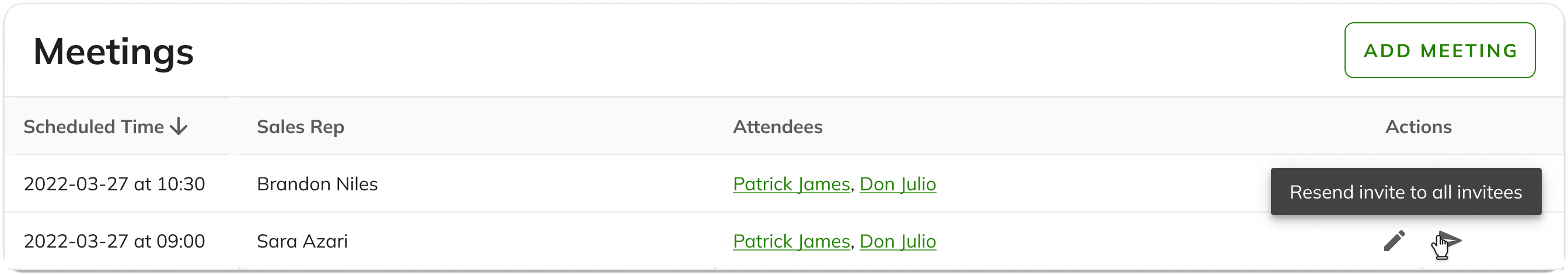
- Meeting Tracking
The sales app is fully integrated with google calendar, allowing the sales reps and their managers to track the meetings they’re having with clients. Meetings are a great indicator of how the sales process is going and how successful the sale will be
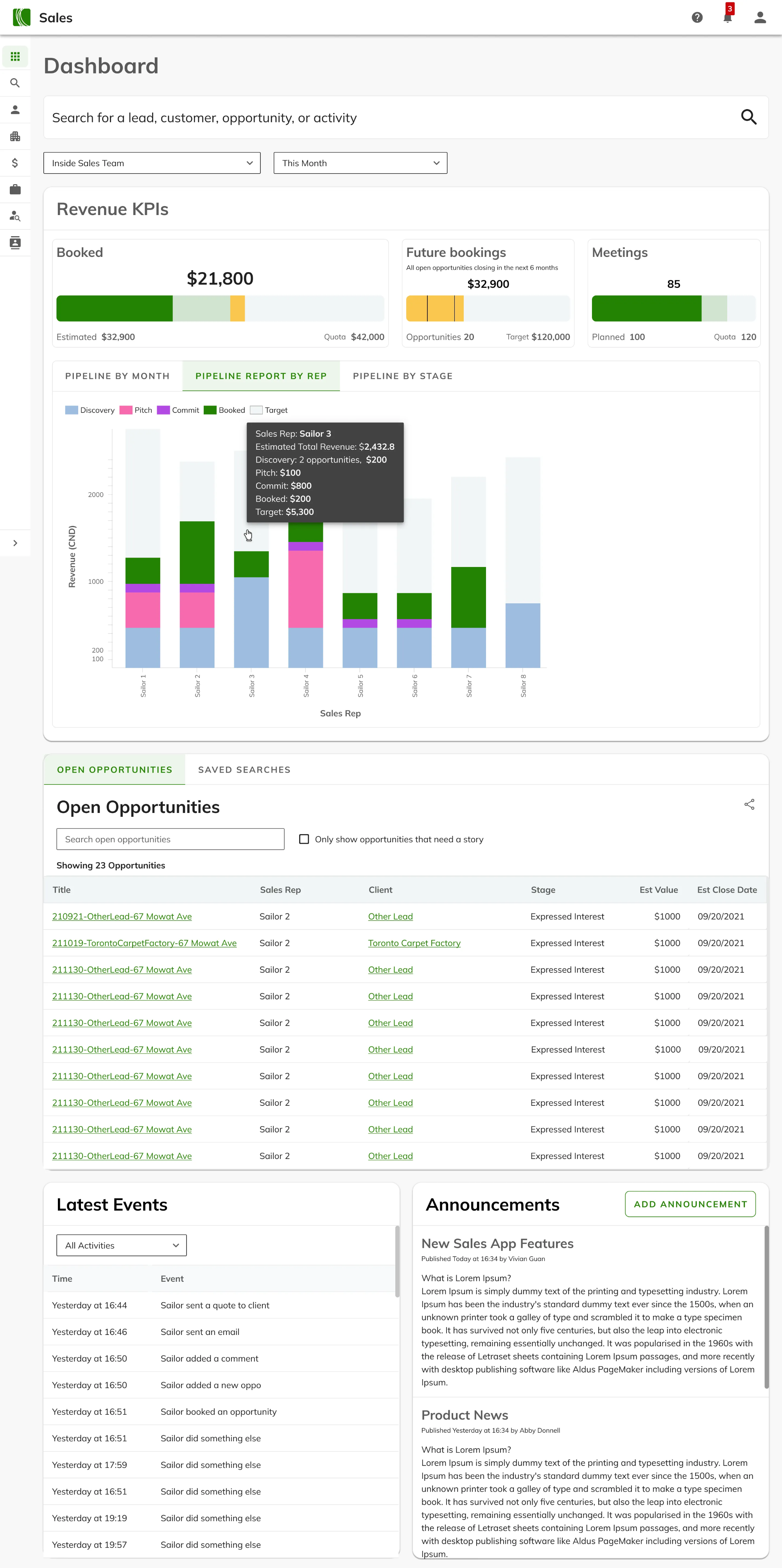
- Sales Dashboard
The dashboard was specifically designed to show important KPI at a glance, including quota, open opportunities, future forecast, meetings, monthly revenue, etc
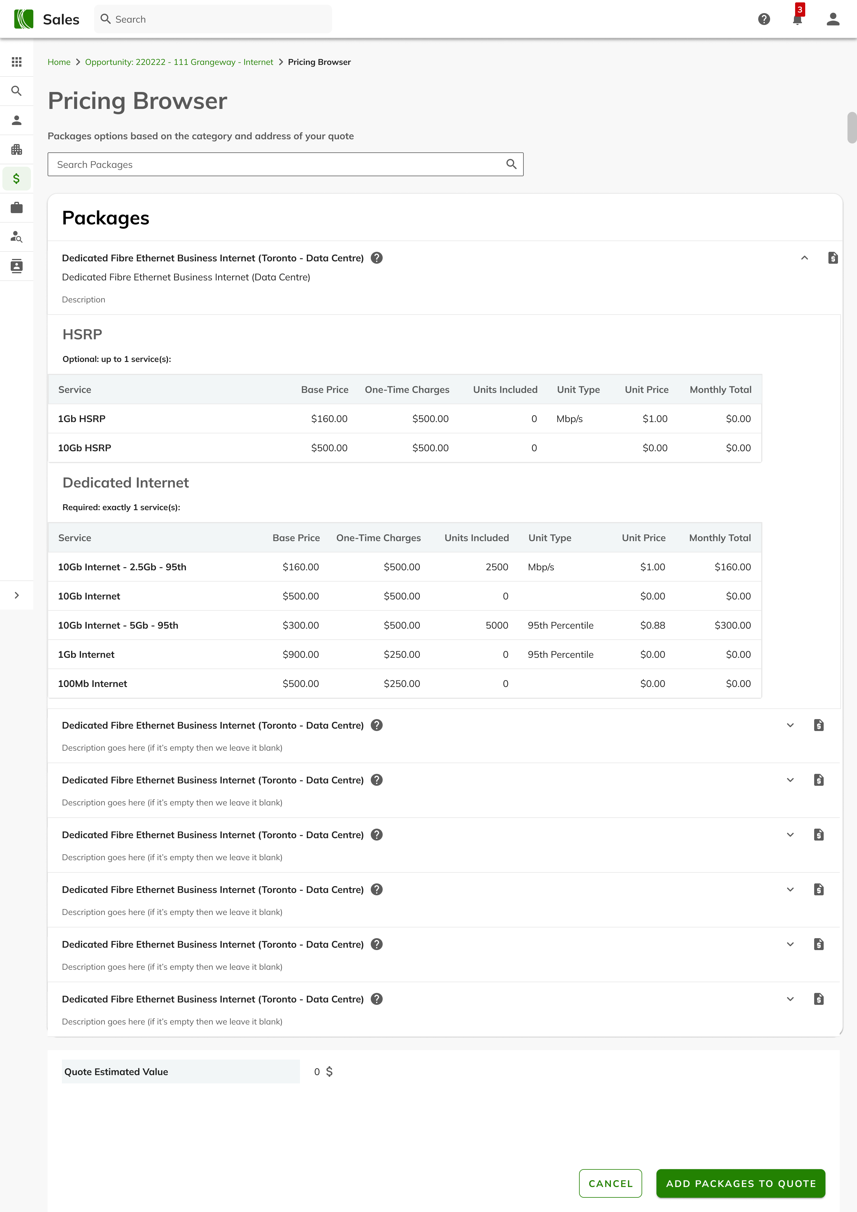
- Pricing Browser
The pricing browser shows all the available products based on the address of the clients, so sales reps can quote customers accurately with just a click
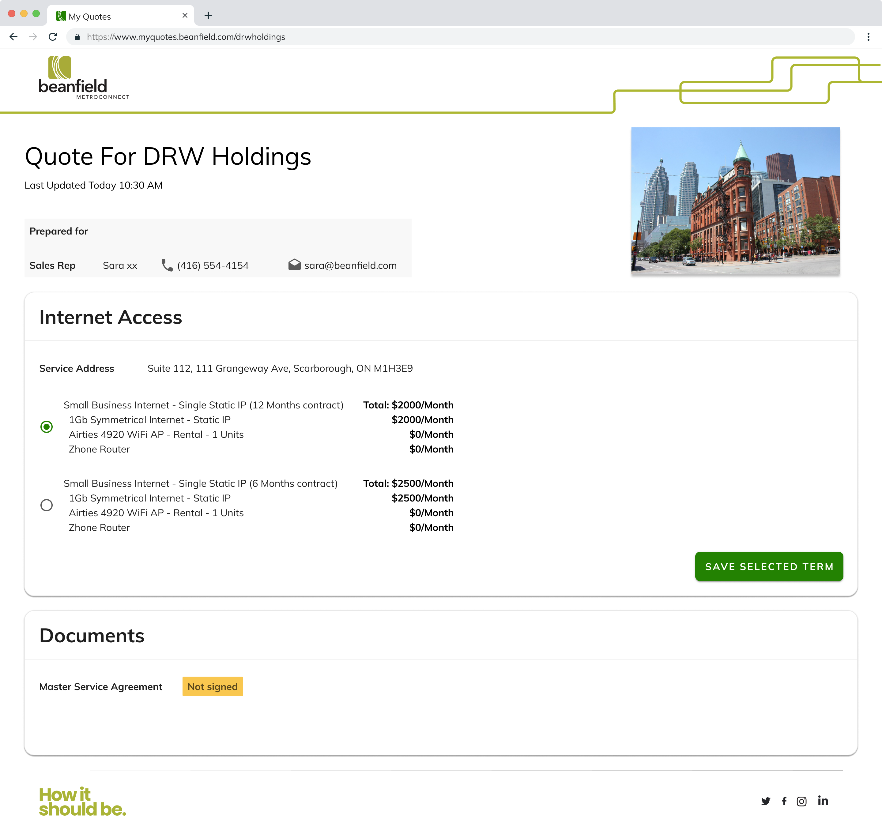
- Myquotes Page
This page was designed to eliminate manual work for the sales reps communicating product offerings with customers. This page is created temporarily on a public URL, showing all the quotes added on the opportunity live, with timestamps. This makes back and forth between the sales rep and the client a breez.
📋 Design Decisions
Information Architecture:
- Once the user logs into the Sales App, they land on the Dashboard.
There is a search field on the dashboard that allows the users to search for leads, customers, opportunities, etc. This is the main workflow for most of the users of the sales app, so I made this live search field look prominent.
- The main navigation of the sales app is through the left navigation drawer. This navigation drawer follows our design system and is always accessible throughout the entire user experience.
This navigation drawer has 2 levels of entries, since some of the pages required to have children pages. The navigation drawer opens when the user hovers over it and stays open as long as the cursor does not leave the drawer.
When the navigation drawer is closed, the users only see the level one parent pages icons, and when the navigation drawer is open, the users will see which parent/child page is selected. They can also interact with the navigation drawer and see the names of all the pages, and navigate to them by clicking on the page name.
- Tabs are used throughout the application to separate data and categorize flows that were related but did not need to be visible at the same time
Settings Page
Dashboard Visualizations
Search results page
- Breadcrumbs are also used strategically throughout the application to help the users understand where they are, and offer a route back to where the user came from
I used the “Entity type: Entity” when needed to clarify further to the user what each breadcrumb entails

picture of information architecture screenshot
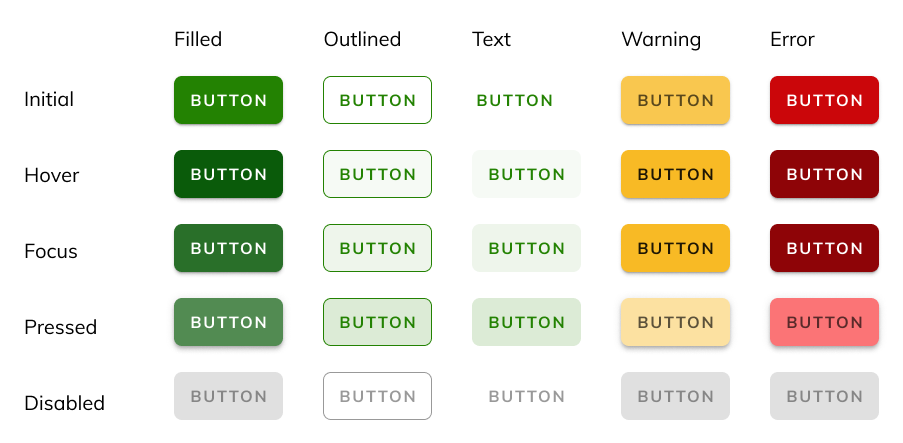
Visual Design: Most UI choices were made to follow the company’s design system which I created. When needed, we made additional components to tweaked the existing ones. The Hopscotch design system also covers everything accessibility related, including font size, color contract, clear tone of voice, etc.
📋 Results and Reflections
- Outcomes: If possible, share any measurable results (e.g., "User testing showed a 20% increase in task completion efficiency").
- Lessons Learned:
Most of the challenges I faced during the design and development of the sales app was the value of clear and open communication with stakeholders. I worked with a small team of developers with limited number of resources. I learned how important it is to be clear about where we were in the process and trying to have a rough timeline is helpful for the stakeholders to manage their expectations. over communication is sometimes the best thing you can do as a product owner.
Another lesson I learned was not getting attached to my designs. More often than not usability research shows that my initial ideas are not the final solution, and it’s okay to pivot.
- Next Steps: I am currently working on the design phase of new features including Commission tracking and Order Submission Templates